Menu
Quality Artwork Examples
I will go over a few examples of proper designs and images to be used with EZScreen stencils.
1 - Black & white designs, meaning monochrome (not photography)
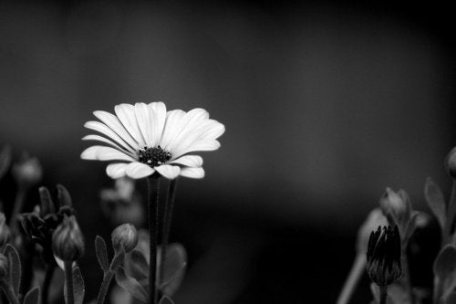
The image above (by Eric Casper) unfortunately will not work to expose EZScreen stencils. Actually, it wouldn't work with any form of screen printing. Because of all the shades of gray, the exposure light or sunlight will go right through and over expose those areas of the stencil. The only color that will properly block UV light is black.
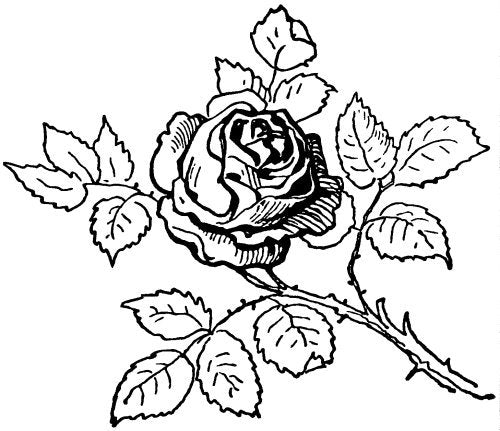
Instead, the black clipart flower image above would work great. The only colors in this image is black and white. The black parts of the design will block sunlight from exposing the stencil and will render a perfect silk screening stencil.
2 - Quality of the image (jagged edges/pixelation)
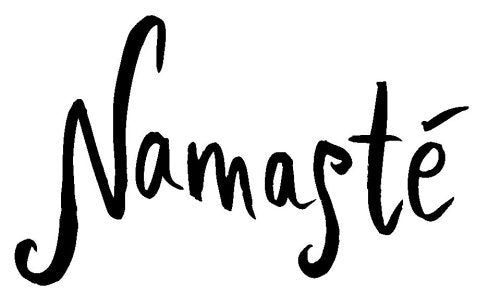
It is extremely important to have a quality printout. The design should be solid black, without any jagged edges or pixelation from enlarging. The example above will produce a quality stencil; the example below will not work.
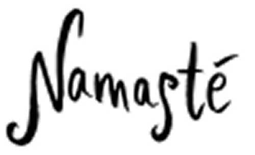
3 - Some detail is too much
Our stencils can hold a surprising amount of detail, but they are not meant for precision screen printing or super detailed designs, either. There should not be any pencil thin lines in the design or it may not come out well.
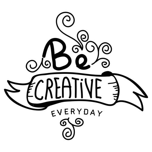
The image above would work great with EZScreen stencils. It is detailed, but the details are clear and visible.
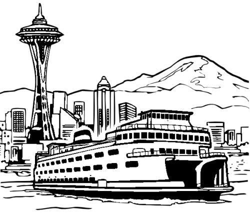
This design unfortunately will have some problem areas in creating a good stencil. Some of the lines in the boat railing is too thin, and the small squares of the windows in the buildings will not be readable. The thin squiggly lines in the mountain may also be too thin to produce a quality screen printing stencil.
These are some basic examples of what quality artwork and design should look like when making an EZScreen stencil. Please contact us or leave a comment if you have any questions.
- Choosing a selection results in a full page refresh.

